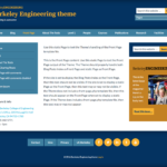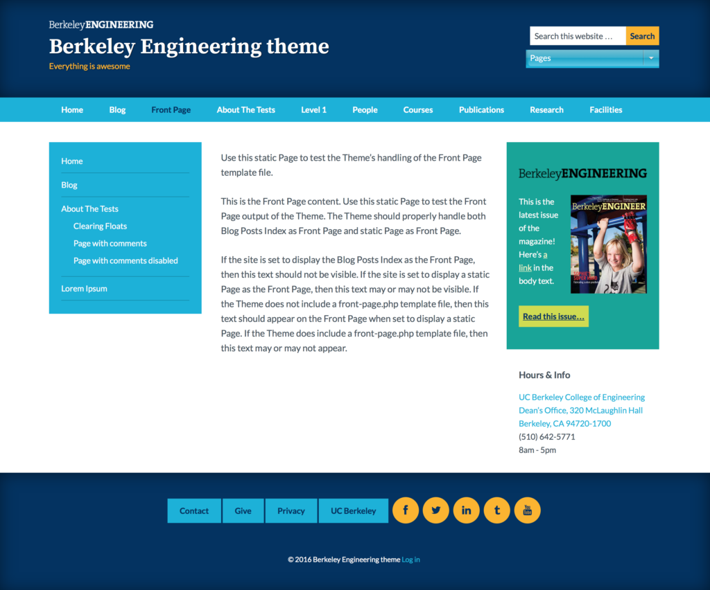
The University of California at Berkeley’s College of Engineering had a huge demand for WordPress sites and not enough staff to handle each request individually. Their marketing team asked me to build a theme framework that would offer a few color scheme options in compliance with the university’s brand guidelines and WCAG 2.0 AA standards. The project would also include five custom post types that the marketing team had determined were common to most of their departments and research teams. Each post type had a list of options, custom fields, and display guidelines.
The resulting theme and plugin suite is the most flexible site framework I’ve ever built. Starting with the Genesis theme as a base, I created a theme with:
- 12 color schemes
- 6 layouts
- 5 custom post types
- 8 custom taxonomies
- a huge set of custom fields
- 3 loop options: list, grid, or table
- a stripped-down whitepaper template for long documents
- a custom editor toolbar button for pull quotes
- 4 custom widgets with smart post type detection and logic
- color scheme presets for form, menu, and search widgets
- a color scheme selector for rich text widgets
- per-post-type sidebars
- per-page widget customizations
- an editable site option for the footer contents
- smart footer widgets that expand based on the number per row
- social media icon support in the footer menus
- support for both SearchWP and Google Custom Search Engines
Admin UI
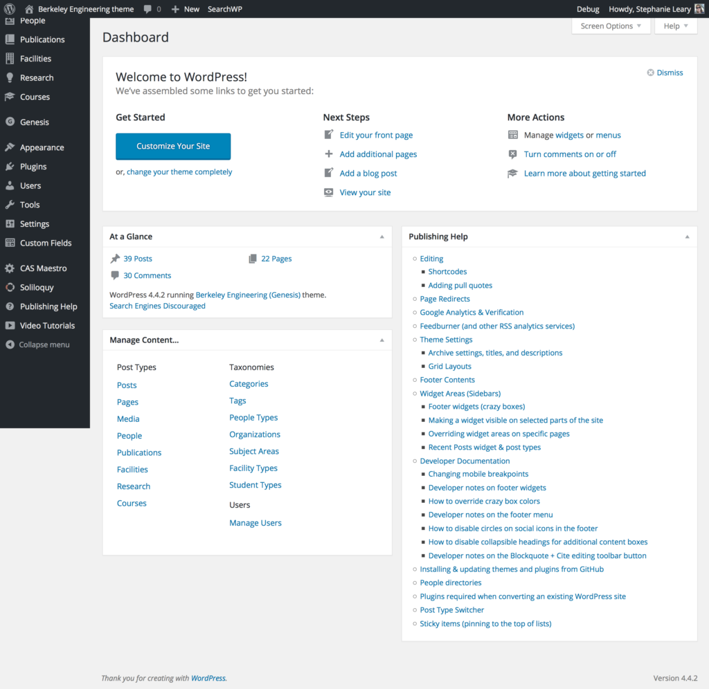
- Wayfinding widget for the Dashboard
- In-dashboard documentation
- Options to disable unneeded custom post types and taxonomies
- Option to change URLs for post types
- Hints and instructions for editors based on post types
- Screen option defaults that hide seldom-used options
The theme and custom plugins follow WordPress best practices, PHP coding standards, data validation and security guidelines, and the theme review checklist. The theme and plugins are internationalized and ready to translate, should the university wish.
A template site has been set up with all the necessary plugin settings and some preset content. The marketing team plans to use WP Engine‘s cloning tools to quickly deploy new sites.
Detailed Overview
Color Schemes and Layout Options
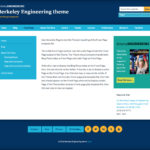
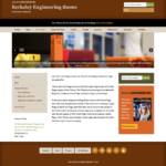
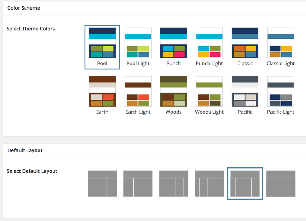
The theme includes six color schemes, each with a light and dark variant, for a total of twelve options. Since most Genesis-based themes’ color schemes include only a single accent color, the standard interface is a simple text dropdown. However, each of the Berkeley schemes involve six or seven prominent colors, so we created a custom visual selector that mirrors Genesis’s built-in layout options.
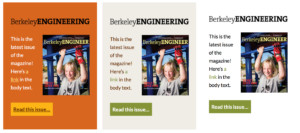
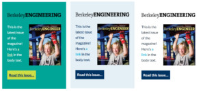
 The College requested a special feature: a color selector to be added to the WP Editor Widget plugin, which would allow site owners to add flexible featured content to their sidebars in color-coordinated boxes. Each color scheme has bold, subtle, and transparent variations. The color selector option could be applied to any standard WordPress widget; the College decided to limit it to a single one for the time being.
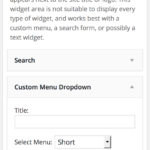
Forms and navigation menus appearing in the sidebars have their own color presets. When combined with the featured content widget, they give the sites cheerful pops of color in keeping with the College’s existing site and the University’s brand guidelines. Site owners could use the transparent color settings for a more somber tone.
The College requested a branding option that would appear above the title in the site header. Rather than allow site owners to upload arbitrary image files, they requested color-coordinated logos that would be turned on or off with a simple toggle. 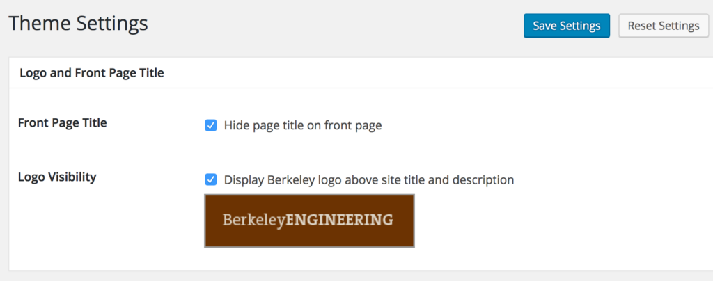

Slideshows, Banners, and Emergency Announcements
The theme includes widget areas above and below the main navigation. The area above the navigation is intended for emergency announcements. Any widget could be placed here, but a simple text widget will appear as a black bar.
The area below the navigation is intended for banner images and slideshows. While the College does not want to encourage its constituents to rely on slideshows, they have included the Soliloquy plugin for those who can’t live without one. Slideshows can be placed in the banner area, in a sidebar, or in any single post or page.
Pull Quotes
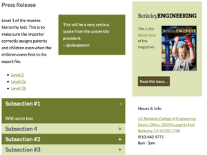 The College wanted to be able to add pull quotes to their text, and they disliked the plain text block quotes offered by the WordPress rich text editor. We created a custom toolbar button that provides a more flexible input, an optional linked citation, and three alignment settings (left, right, center).
The College also asked for collapsible sections for additional content. Like the pull quotes and sidebar widgets, these have presets for each color scheme.
Whitepaper Template
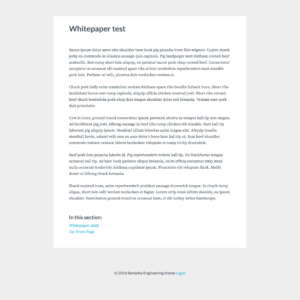 To help the College move away from PDF documents, we included a Whitepaper page template in the theme. This stripped-down look is applied to individual pages. It removes the site title, navigation, sidebars, and most of the footer. Instead, it displays the page title and contents in a monochrome format with fonts and line length optimized for easy reading, and includes navigation only to other Whitepaper documents. Using this template on multiple pages, it’s possible to present anything from a research abstract to a book in an accessible, mobile-friendly web-based format.
Footer Magic
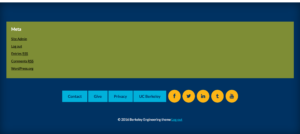
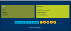
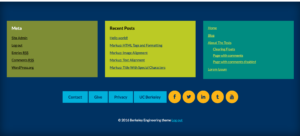
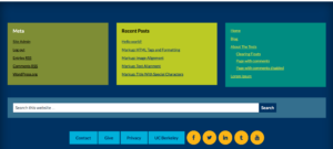
The theme supports up to three rows of widgets in the footer area. Each row may contain up to three widgets. The footer widgets use four preset colors (varying by color scheme) and expand to fill their rows. A single widget in a row will fill the entire page width; a row of three widgets will be divided into thirds. On mobile, the widgets become full-width stacked boxes. The color and width assignments are automatic; there are no user settings for widget color or width in the footer.
The footer menu is similarly automatic. Any links to known social media sites will be transformed into icon buttons. Users may also assign social media icons to unrecognized URLs—ideal for URL shorteners or campaign trackers. Again, the colors are preset according to the site’s color scheme. On mobile screens, the menu will split into two rows at the division between normal links and social media icons.
Content Model
At the top of the College’s list of requirements was support for a content model that would suit most of their constituents. Because the model they had devised closely matched that of several previous projects of our, we were able to offer a few suggestions and build the model at the outset of the project, long before the design was finalized. The Marketing team had plenty of time to enter content, experiment in the administrative interface, and request changes to the final layout.
The final model consists of five custom post types, five always-on taxonomies (some shared across post types), and three optional taxonomies for People.
| People | Courses | Publications | Research | Facilities |
|---|---|---|---|---|
| Subject Areas Organizations People Type Student Type (Committees) (Groups) (Research Areas) |
Subject Areas Organizations |
Subject Areas | Subject Areas | Subject Areas Facility Type |
Post types can be turned off in the site’s General Settings, if the full range of options is not needed. This keeps the administrative interface as uncluttered as possible.
Each post type has a dedicated editing interface with custom field inputs. For People and Facilities, different sets of inputs are shown depending on the selected People type (faculty, staff, student) or Facility type (building, lab, room, equipment). For example, faculty are invited to list their education, publications, and research interests; whereas students are instead asked to enter their major and class year.
The editing screens include specialized hints and reminders for editors. We have agreed on custom screen option defaults that hide seldom-used options, streamlining the editing interface as much as possible for new users while allowing experienced editors to toggle the inputs they need.
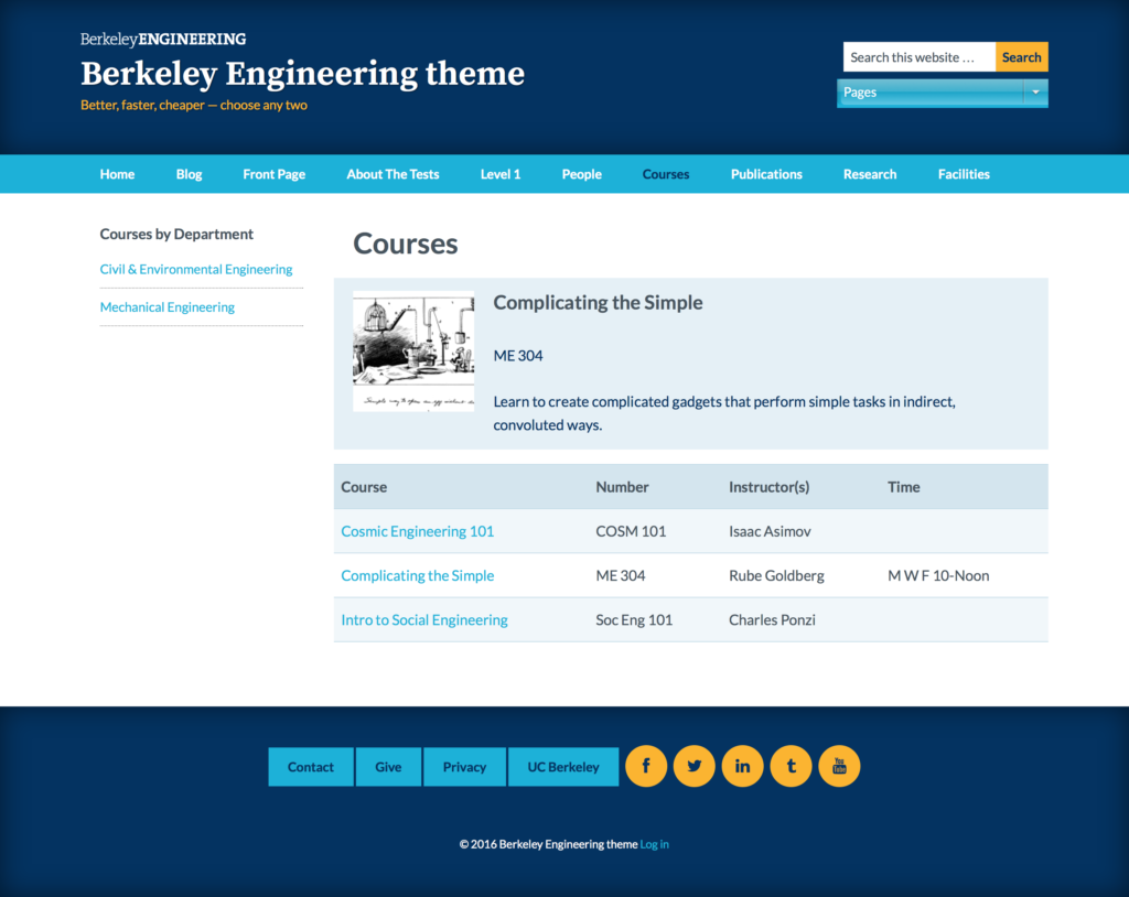
The Courses listing is set to display as a table, sorted by course number. All other post types use archive setting options to determine whether they should be displayed as a list, with or without thumbnail images, or as a grid. In all cases, a single featured item may be displayed above the full listing.
Staff directory in any page
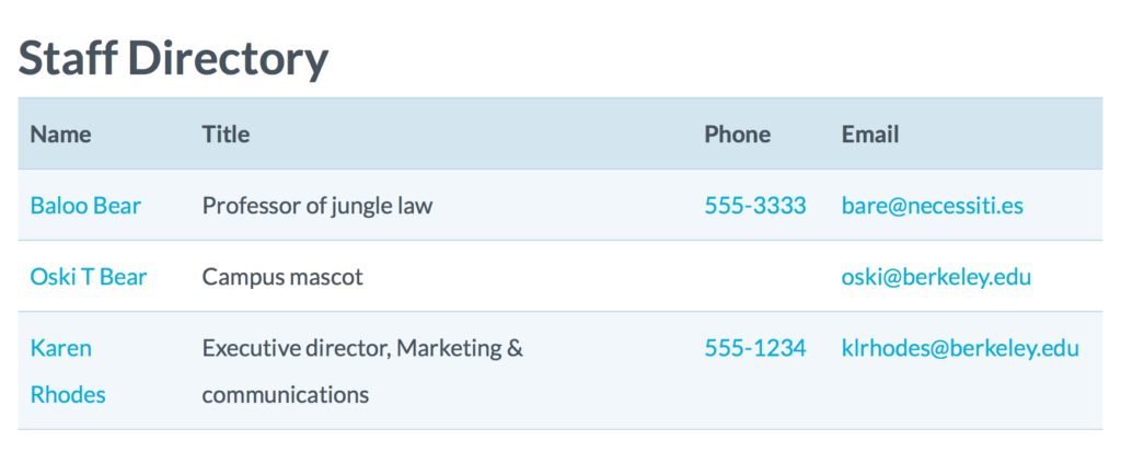
There is an optional people directory that can be inserted into any page using a shortcode. It can be filtered by people type—for example, the site owner could create a directory table containing only faculty and staff. This directory is always sorted by last name and does not support featured items or images.
On mobile devices, the phone numbers become links, which you can tap to call. The directory uses microformat markup that allows individuals’ contact information to be transformed into downloadable vCards.
Changing custom post type URL slugs
All Genesis-based themes include archive settings for each post type. This page allows site owners to customize titles and descriptions for the listing pages—for example, one could change the Research heading to Projects.
The College requested a custom option to allow site owners to change the portion of the URLs specific to the custom post types (the slug). For example, WordPress would normally use example.com/people for the complete listing of the people post type. This was a highly unusual request, but was surprisingly easy to implement.
Widget Magic
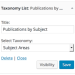
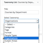
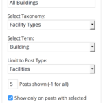
Each post type has its own customized primary sidebar. To facilitate navigation within the post type sections, we created two custom widgets that take advantage of the site’s numerous taxonomies: Taxonomy List and Posts by Term. Both use smart post type detection for taxonomies shared across multiple post types, like Organizations and Subject Areas. When used in a post type’s sidebar, they list only information relevant to that post type (e.g. administrative departments used only for People do not appear in Course listings), and they link to information filtered to the currently-viewed post type. When choosing a department from a Course listing, you’ll see only Courses, not a mix of Courses and People.
We’ve also filtered the built-in WordPress Recent Posts widget to respect the post type of the page on which it appears. When used in the Publications sidebar, it lists recent publications instead of blog posts.
Site owners can replace widgets on a per-page basis in both the sidebars and the footer. However, the widgets we have set up in the template site, which will be the basis for all new sites, should serve for most constituents.
Mobile Menus, Columns, and Tables
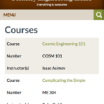
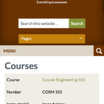
On phone-sized screens, tables rearrange themselves into stacked rows of data, with column headings shifted to the left and repeated for each record. Empty columns are omitted entirely.
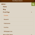
The mobile version of the menu accommodates multi-level hierarchies. Both the menu and the header widget area are hidden behind toggles on mobile screens.
Multi-column and grid layouts are visible on tablet and desktop sizes, but turn into single-column lists on phone-sized screens.
Documentation
As with almost all of our projects, the Engineering theme and plugin suite includes a custom Dashboard wayfinding widget and extensive in-dashboard documentation.
