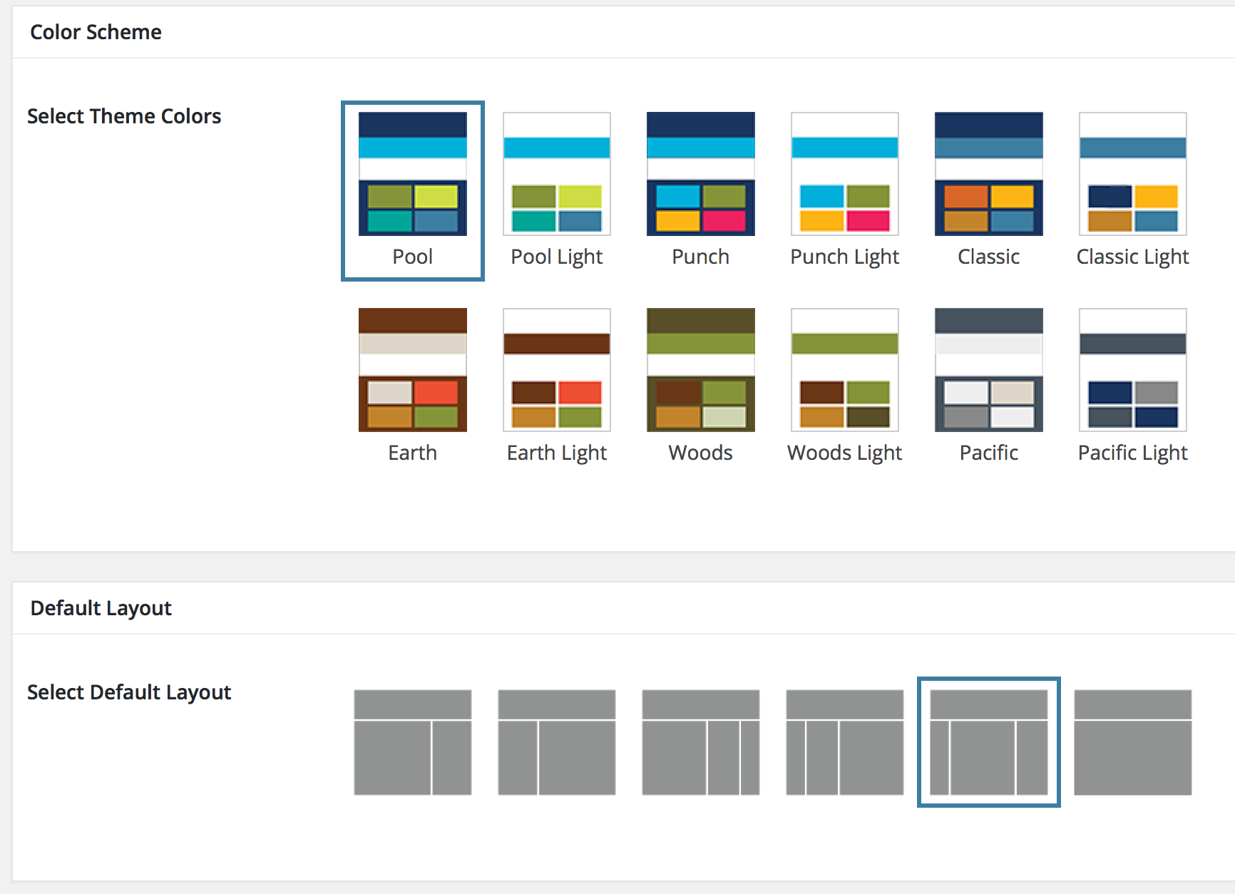
Most Genesis themes come with several color schemes. However, most of the time, these feature one prominent color. The built-in color scheme chooser is therefore a simple dropdown list of color names: Red, Green, and so on.
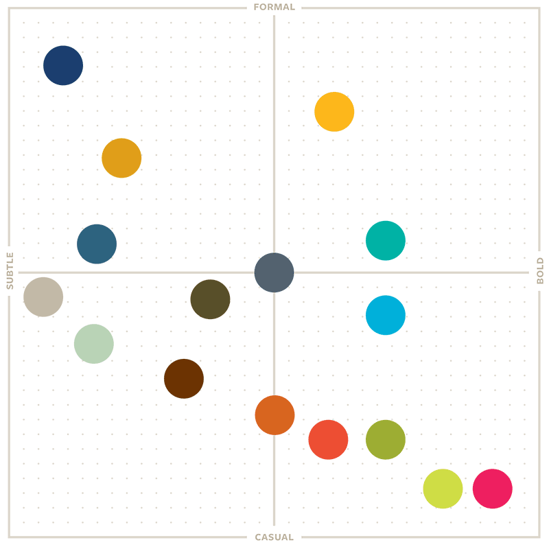
When I started talking to the Berkeley College of Engineering‘s Marketing staff about creating a flexible WordPress theme for the College’s various divisions to use, they mentioned early on that they’d like several different color schemes based on the university’s brand guide. Berkeley, as it turns out, has a fantastic color guide.
 I had so much fun mixing up the colors that I couldn’t stop, and I very quickly found myself with twelve color schemes. (Really six, but each has a light and dark variation.)
The problem was that none of the color schemes had one single standout color; they each had more like four. And that meant that the usual Genesis color-name dropdown was not going to cut it.
Instead, I removed the original Genesis Color Schemes meta box and replaced it with a new one based on the Layout Settings box. I created icon images for each color scheme, added a few lines of CSS to accommodate my images’ taller height, add space for captions, and make the selector border stand out a little more.
The end result gives site owners a much better idea of what the color schemes look like.
Here’s the PHP. You’d need to copy this to your theme (probably in functions.php) to create something like this for your site:
https://gist.github.com/sillybean/28a21e82cc53c388fab1ec52dce79524
Note that there are images for each color scheme, all stored in the theme’s /images subdirectory. You might need to change the filename and path logic, depending on your setup.
And here’s the admin-style.css file referenced:
https://gist.github.com/sillybean/47813c970d24cac95cfce85443ae8fac
Read more about the Berkeley College of Engineering theme project.


Thank you very much for sharing! Much better for customers to choose a colorscheme.