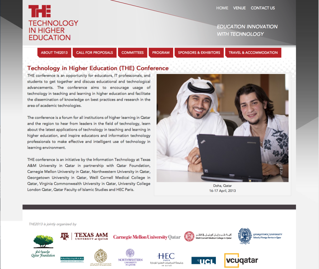
This group needed a site for their conference, and they needed it done in a hurry. They had a Photoshop comp from their designer, but it was a fixed width design, and they wanted a mobile-friendly site. I decided to make it responsive, and I worked with them to determine content priorities for mobile widths and rearrange the navigation menu for very small screens. We also worked quite a bit on the program schedule table to make sure all the information is accessible and clear on tablets and phones.
This was my first Genesis theme project, and I was quite pleased with the framework and the end result.


